


[Project 002] User Interface Design: Academic Calendar
- Zeyong Jin
- Aug 16, 2021
- 13 min read

Section 1
Section 1.1: Context Identification 1) When: this calendar will be used and this interface will be accessed when users want to check events and dates in the calendar. The date and the time zones of the calendar will be set based on the time zone in the computer system, so the current date in this calendar will be updated automatically. 2) Where: since this calendar is designed for students, students can access it at school or home via the Internet, log in and view the calendar. 3) Who: this calendar is designed for students who are currently studying in universities and colleges. 4) What: this calendar is designed to help students to add, modify and check their events, including lectures, assignment due dates and extracurricular activities. 5) How: users can open and view this calendar on browsers, so the UI interface of this calendar will be designed based on the browsers. Users can also view and access this calendar via the client desktop.
Section 1.2: User Identification This online calendar is designed for students who are currently studying in universities and colleges. Their course schedules will be integrated into the calendars, and students can also add new events into the calendars. The calendars will send notifications in case students miss any important events. The first persona is Tom. Tom is a 20-year-old and year-three COGS major student. He loves socializing and sports. Tom is very good at making friends and often participates in and organizes various activities. Therefore except for courses, Tom also needs to create various new events on the calendar to remind himself. The second persona is Joe, a 21-year-old and year-four CS major student. Joe is about to graduate, his schoolwork is very busy, with many deadlines and lectures every week. There is nothing on Joe's calendar except for academic arrangements. Joe usually needs to set up many reminder alarms to remind himself not to forget important deadlines.
Section 1.3: Functional Requirements 1) An undo button to prevent users from deleting important events by mistake. "Undo" will store the user's nearly 5 operations in a stack and pop out the top operation when the button is clicked. This can effectively prevent users from accidentally deleting events or other wrong operations. 2) The "invite" is used to send event invitations. The calendar can send it by filling in the date and event name and the receiver's email address. The system will automatically generate a link based on the above information and send it to the target mailbox, and the detailed event information will also be sent. When the recipient clicks the link in the email, the event will be automatically added to the recipient's calendar. 3) A strong reminder button. Users can select the events that need to be strongly prompted and design the prompt advance time and frequency. The system will automatically send a reminder email to remind users to participate in important events.
Section 1.4: Non-functional Requirements 1) Night mode. At night, users can use night mode to switch the overall colour (Continue of non-functional req.) tone, background colour to protect eyes. 2) Users can choose to jump to other months or years which are not showing in default pages. Students can also view past and future events. 3) Users can change the font sizes and languages.
Section 2: LFP
Section 2.1: LFP 1

Figure 1: Screenshot of the first LFP via Balsamiq [1].
For the functional illustration, inspired by Jakob Nielsen's 10 principles [2]: 1) The calendar implements the function of importing and exporting calendars. Its interface is connected to the python API script, and the xlwt library is used to analyze excel documents. 2) The calendar provides the bottom right button attached to the text in small gray font to give the user a prompt to undo operations. 3) The calendar can create a new event by clicking on the “Create” button. For the non-functional illustration: 1)Visual tone. The overall design style is concise to avoid distracting users from unimportant elements. Bright colour contrast improves the recognition between different events and tags, making different events easier to distinguish. The past event is translucent, reducing the recognition of unimportant events. It improves users' reading and searching efficiency. 2) The button on the top of the calendar can switches to the year, month or date mode of the calendar. 3) Related buttons are designed in the corresponding area, for example, the mail function is placed next to the user’s name to facilitate users to establish contact. Relatively unimportant functions such as "night mode" and "help" are placed in the corner to avoid excessively large icons from affecting the user's reading experience. 4) The calendar provides a night mode.
Section 2.2: LFP 2

Figure 2: Screenshot of the second LFP via Balsamiq.
For the functional illustration: 1)Users can add events by clicking the date on the calendar body or the date on the small calendar on the right side of the page. 2)When filling in the items, the user can select the time of the event by sliding the time bar to avoid inputting illegal time. 3)When the user finishes editing the event, click the "Share" button at the upper right corner of the event bar, and the event will be shared with the selected person in the form of an email or link. 4)If the user feels that the event is significant, then clicks the “Favorites” button in the upper right corner of the event bar, and the system will automatically add the event to the reminder item, sending an email or text message the day before the event occurs. 5)If users add or delete an erroneous event, then undo their previous action by clicking the Undo button at the bottom of the event bar or the bottom right of the page. 6)When users want to connect with other users, they can click on the mailbox button in the upper right corner of the page to share events, send emails, etc. For the non-functional illustration: 1)The users can click the moon button in the upper right corner of the page to turn on or off the night mode. The background of the page under the night mode will be changed to black automatically. Meanwhile, the system will choose to turn on the night mode automatically according to the time. 2)Users can change the calendar format by clicking the YMM bar at the top of the page or the YMM select button on the small calendar on the left (Continue of NFR illustration) of the page to view the events previously added to the calendar. 3)Users can click the setting button in the upper right corner of the page to change the font format and size of the page and choose to change the language displayed in the calendar. The system will automatically translate all the text on the page into the language selected by the users. 4)When the users encounter system failure using the calendar, users can click the red ladybug button in the upper right corner of the page to give feedback. The system will automatically send out the parameters of the fault.
Section 2.3: LFP 3

Figure 3: Screenshot of the third LFP via Balsamiq.
For the functional illustration: 1) Users can click a date in the calendar, and then courses and events which has been added to that date will be shown to users separately. 2) Users can enter event titles, locations, dates and content, and click create button to add it to the calendar. 3) Users can also clear all texts and undo the last five actions. 4) Users can import courses from the canvas and remove all courses which have been added to the calendar. Users can also invite other users, send messages to others. Users will receive notifications of all events and courses which will be held tomorrow. For the non-functional illustration: 1) Users can change the background colours from white to black, and all other colours will also be adjusted based on the background colours. 2) Users can change the language. 3) Users can screenshot the calendar.
Section 3: MFP
Section 3.1: H-MFP

Figure 4: Screenshot of the horizontal MFP via Figma [3].
Regarding our MFP, we have combined 3 LFPs well. Firstly, we chose the calendar style from LFP3 because such a calendar looks more concise and more intuitive. Secondly, regarding the layout of the icon buttons, we chose LFP2. The reason is that we think putting all the icons together is more convenient for users to find. Thirdly, we choose the way of creating events in LFP3. Because we think creating events is the most basic function of our calendar. So, the calendar should use the fewest steps to allow users to create events. There is no need to click additional buttons, just enter the information and click 'Create.' Fourthly, we think that the pop-up window of LFP2 is excellent, which can save a lot of space. Finally, we chose the detailed text in LFP1. For example, a text description like "Didn't see your event" with a light colour or underline can be used to click or describe. Of course, there are more combinations, so that I won't go into details here. Most of our interactive buttons will have a pop-up window and perform more operations on these pop-up windows. Figures are in the Appendix I. Firstly, about the function 1---"Undo" button (Appendix I Figure 1). This is a function that cannot be displayed in H-MFP (but our V-MFP has). "Undo" will store the user's nearly 5 operations in a stack and pop out the top operation when the button is clicked. Click the "undo" button, the created event will disappear, and the deleted event will return. After the setting is stored, "undo" will change it to before storage. After the reminder is set, undo will cancel the setting or become before modification. But "undo" cannot cancel sending invitations. Because the invitation is created and sent in time, but the sent email cannot be "undo." All of these operations must occur within five operations, so the "undo" button can only be clicked five times in a row. Secondly, the icon buttons --- the mail icon is the invite button up (Appendix I Figure 2). This is our second function. After clicking it, an “Invite Create” pop-up window will pop up (Appendix I Figure 3). In the pop-up (Continue of the icon buttons) window, you need to fill in the recipient's email address. The "Add more" button can add more recipients. It can also be added directly from the "Friend List." Then fill in the title, event, address and description of the event to send the invitation. The location can also be selected via Google Maps. Thirdly, the icon buttons again --- the bell icon is the reminder button (Appendix I Figure 2). This is the third function. After clicking, a “Create Reminder" pop-up window will appear (Appendix I Figure 4). After selecting the date, the user can select one of all events on that day. Next, the user can select the importance of the reminder or customize the reminder interval. Then choose how long before the event to be reminded. Finally, select the reminder method to complete the creation. Fourthly, about the non-functional icon buttons. The gear icon is "setting" (Appendix I Figure 2). The user can set the language, font size, default reminder method and automatically start a reminder (Appendix I Figure 5). The question mark icon is a "help" button. There are detailed descriptions of the calendar and function descriptions. Users can inquire about problems and report bugs in the “Help” pop-up window (Appendix I Figure 6). The switch icon is “Night Mode.” This is not shown in the H-MFP (Appendix I Figure 7), mainly because the colour adjustment is too difficult for the designer. The night mode will set the background to a dark colour when it is turned on. All UI colours are adjusted to bright warm colours. The colours of all fonts are also slightly brighter and warmer. Avoid blue and white light. The small calendar icon (Appendix I Figure 8) on the calendar is used to jump year and month. After clicking, the user can select the year and month they want to jump to (Appendix I Figure 9). Finally, about the calendar's most important and basic functions, creating events and viewing events. Creating an event is very simple, and there is an information input box next to the calendar. After entering all the information, click the "Create" button to create an event (Appendix I Figure 10 & 11). The reason for this is to allow users to operate the most basic functions with the fewest steps. Then view the event. There are two types of icons on the date. A blank exclamation mark (Appendix I Figure 12) is an event that has passed. A yellow exclamation mark (Appendix I Figure 13) is an event on this day. After clicking a date, a pop-up window with one of three colour banners (Appendix I Figure 14) occurs. The white banner represents the past event, the red banner represents the upcoming event, and the blue banner represents the event is far away or has not been planned yet. The pop-up window will also display the title and time of the event content in the pop-up window. Click on the title, and there will be detailed information (M-LFP not demonstrated, V-LFP has). If there are too many events, a scroll bar will appear to display more content. You can also use the mouse to drag up and down to scroll (not demonstrated by M-LFP). In the lower right corner of the window, you can also check the type of title to be displayed. If unchecked, the window will not display the related content of this type (not demonstrated by M-LFP). All of the above pop-up windows will have scroll bars when there is too much content and support mouse dragging.
Section 3.2: V-MFP

Figure 5: Screenshot of the pop-up window of July 15th.
All 24 figures are in Appendix II. For the meaningful features: 1) This MFP focuses on the features of the event. It implements functions of adding, deleting, editing, viewing events through the home page or pop-up windows of the calendar. The system allows the user to import or remove all the events of currently enrolled courses to or from the calendar. 2) When the user is creating an event, this calendar provides default values for the title, location and type of the event. It also allows the user to clear all input or reverse recent 5 operations. 3) This calendar maintains robustness and error handling. It could detect invalid event time or nothing input. Then the system shows an error message and asks the user to enter the time again. If the user wants to delete an event, the system would ask the user to confirm. 4) This system has a grammar check function and matches the user’s input to the past information. After checking, the system might provide the user with some suggestions. The system will generate a new event whose contents are dependent on the user’s choice. 5) The system allows the user to view events on different days. For the pop-up window showing events on a certain day, there is a checkbox before each type of event for the user to select. 6) The calendar can show the map of the event location, but this feature is still under development. For the interaction steps: 1) On the calendar, some icons of exclamatory marks showing on the top right of some dates, meaning there are events on these dates. Coloured icons indicate there are future plans these days. Black-and-white ones mean the plans on these days are overdue. 2) After clicking on the button of importing courses, Also, there would be a toast indicating successful import. 3) By clicking on a certain date, the background of the selected date turned indigo. All the events of this date would be displayed via a pop-up window. 4) For the pop-up window showing events on a certain day, it has the current time on top. The background colour of the date changed by events. Overdue events have strikethroughs. The icons on the two sides of the pop window indicate the kinds of events on this day. All the events are ordered by happening time, then the creation time and the alphabetic order. If there are over 3 events on this day, a scroll bar would occur for the user to view all events, which is under development. 5) The user can click on the event on some date, then a pop-up window shows the information of the event. If an event whose location is not TBD, the user can click on the map icon to find out the address. Since this feature is under development, if the user clicks on the icon, a pop-up window showing apology occurs. 6) If the user wants to edit the selected event, click on the edit button at bottom of the pop-up window of the information of the event. It is changed to the event editing window; the user could edit or delete the event. If the user clicks on the button of deletion, the system would ask the user to confirm via a pop-up window. 7) When the event is changed, the pop-up window of this day changes, the same as the home page. When there are pop-up windows, the user could only operate on the top-most pop-up window. Other windows and the home page would be disabled, but this feature is under development, so it is expressed as setting background colours of disabled pages to dark gray in this MFP. 8) When inputting the details of an event, by clicking on an “Undo” button, the user reverses the recent 5 operations (storage is unavailable). The user can clear all the input by clicking on the “Clear” button. 9) After the user clicking on the “Create” button, if the system detects invalid event time or nothing input, then it shows a warning pop-up window and asks the user to enter the time again. It also changes the colour of the input area to red to attract the user’s attention. 10) The system may provide some suggestions via a pop-up window. The event’s content depends on the user. After the event is added, a pop-up window of congrats occurs.
Section 3.3: Learning from Designing MFPs
Consideration/Trade-offs:
1) There are several components or features mentioned on the H-MFP, but on a V-MFP, only one of them could be further implemented. In this case, we choose to implement events, as we think this is the most important part.
2) For the consideration of consistency, modifications should be applied to both MFPs. The longer the V-MFP is, the heavier the workload is.
Couldn’t dos:
1) Disabled pages are hard to express on both MFPs.
2) Night mode and map feature are hard to express on both MFPs.
3) Undo feature is hard to show on the H-MFP. The storage of the last 5 operations could not be shown on the V-MFP.
Strength/Weakness:
1) Strength: We nearly implement every necessary component on a calendar.
2) Strength: The user can report bugs and find help documentation.
3) Weakness: Too many pop-up windows are used, which may make the user feel uncomfortable

Figure 1: Undo button.

Figure 2: Icon buttons.

Figure 3: “Invite Create” pop-up window
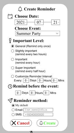
Figure 4: “Create Reminder" pop-up window.

Figure 5: “Setting" pop-up window.

Figure 6: “Help/Query" pop-up window.

Figure 7: “Night Mode" pop-up window.

Figure 8: A small calendar icon to jump year and month.

Figure 9: “Year/Month Selection" pop-up window.

Figure 10: Event details window.

Figure 11: Congratulation pop-up window.

Figure 12: One day with past events.

Figure 13: One day with future events.

Figure 14: Pop-up windows of dates.

Figure 1: Initial page.
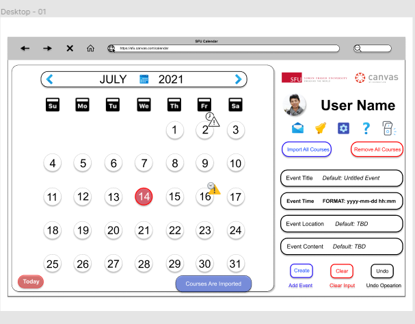
Figure 2: After importing courses, a toast and icons occur.

Figure 3: “15” is clicked.

Figure 4: Pop-up window of July 15. Other pages are disabled.

Figure 5: Pop-up window of July 2.

Figure 6: Pop-up window of July 16.

Figure 7: Pop-up window of adding event.

Figure 8: Back to home page.

Figure 9: Warning pop-up of no time input.

Figure 10: Warning pop-up of illegal time input (2021-07-32 11:52).

Figure 11: Correct input.

Figure 12: After clicking the clear button.

Figure 13: After clicking on the undo button.

Figure 14: Pop-up window of suggestion.

Figure 15: Pop-up window of adding an event successfully.

Figure 16: After adding one event to July 15.

Figure 17: Pop-up window of July 15.

Figure 18: Pop-up window of event info.

Figure 19: Pop-up window of apology.

Figure 20: Pop-up window of editing event.

Figure 21: Pop-up window of confirming event deletion.

Figure 22: Pop-up window of July 15, after deleting the only planned event.

Figure 23: Home page, after deleting the only planned event on July 15.

Figure 24: Adding an untitled personal event to July 16.
Appendix III: References
[1]
Balsamiq, "Balsamiq Tutorials," Balsamiq, 2021. [Online]. Available: https://balsamiq.com/tutorials/. [Accessed 14 July 2021].
[2]
J. Nielsen, "10 Usability Heuristics for User Interface Design," Nielsen Norman Group, 15 November 2020. [Online]. Available: https://www.nngroup.com/articles/ten-usability-heuristics/. [Accessed 14 July 2021].
[3]
Figma, "Learn Design with Figma," Figma, 2021. [Online]. Available: https://www.figma.com/resources/learn-design/. [Accessed 16 July 2021].
Appendix IV: Presentation
See https://www.zeyongjin.net/presentation.
![[Project 004] Spaceship Titanic: Predict Which Passengers Are Transported to An Alternate Dimension](https://static.wixstatic.com/media/da88c4_5ebc85f91fa34223a4d6e9f713e96975~mv2.jpg/v1/fill/w_980,h_776,al_c,q_85,usm_0.66_1.00_0.01,enc_avif,quality_auto/da88c4_5ebc85f91fa34223a4d6e9f713e96975~mv2.jpg)
![[Project 003] NLP: Prompt-based Text Matching Methods for Fake News Stance Detection](https://static.wixstatic.com/media/da88c4_d35cfe43b9b34b008fa115bd47b186a3~mv2.jpg/v1/fill/w_980,h_571,al_c,q_85,usm_0.66_1.00_0.01,enc_avif,quality_auto/da88c4_d35cfe43b9b34b008fa115bd47b186a3~mv2.jpg)
![[Project 001 Description] Data Science: OSM, Photos, and Tours](https://static.wixstatic.com/media/nsplsh_76667a666176555a6d6663~mv2_d_3456_1758_s_2.jpg/v1/fill/w_980,h_499,al_c,q_85,usm_0.66_1.00_0.01,enc_avif,quality_auto/nsplsh_76667a666176555a6d6663~mv2_d_3456_1758_s_2.jpg)
Comments